

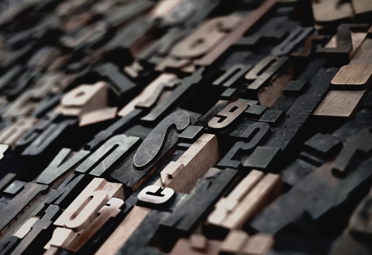
Mixing typefaces is one of those design skills that looks effortless when it works and painfully awkward when it doesn’t. The most reliable trick in the book? Pair a serif and a sans serif font. It’s a classic combo for a reason: the contrast is built in, the hierarchy almost designs itself, and the result feels both polished and readable.
In this guide, we’ll walk through the principles that actually matter, the mistakes most beginners make, and 8 tested pairings you can drop into your next branding or web project.
Why pair serif and sans serif fonts in the first place?
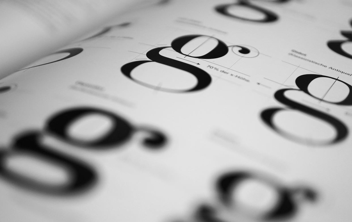
Serifs (the small strokes at the end of letters) carry centuries of editorial weight. They feel traditional, warm, and authoritative. Sans serifs feel cleaner, more neutral, and more modern. When you put them side by side, you get something neither one can deliver alone: visual tension with clear hierarchy.
That’s why this pairing dominates editorial design, SaaS websites, fashion branding, and pretty much every modern logotype you scroll past.
- Contrast without chaos: the two styles are different enough to create hierarchy but similar enough to coexist.
- Built-in personality split: one font does the storytelling, the other handles clarity.
- Better readability: pairing display serifs with workhorse sans serifs (or the reverse) keeps long blocks of text easy on the eyes.
The 5 rules that actually matter
1. Lead with contrast, not similarity
If your two fonts look almost the same, you’re not pairing, you’re confusing. Push the contrast: a high-contrast display serif against a geometric sans serif works far better than two neutral typefaces fighting for the same job.
2. Pick one star and one supporting actor
Decide which font carries the personality (usually the headline) and which one stays out of the way (usually the body copy). The most common formula:
- Serif headline + sans serif body: editorial, trustworthy, magazine-style.
- Sans serif headline + serif body: modern brand voice with a literary, readable feel.
3. Match the mood, not the shape
Look at proportions, x-height, and overall warmth. A geometric sans like Futura wants a serif with similar geometric bones (think Bodoni). A humanist sans like Source Sans pairs more naturally with a humanist serif like Lora.
4. Limit yourself to two fonts
Three is the absolute maximum and only if you have a reason. A serif, a sans serif, and a display or script can work, but most projects only need two well-chosen typefaces with multiple weights.
5. Test at real sizes
A pairing that looks great in a moodboard often falls apart at 16px on a phone screen. Always preview at the actual size and weight you’ll ship.
Common mistakes to avoid
- Using two fonts that are too similar: pairing two humanist sans serifs gives you mush, not contrast.
- Ignoring x-height: when one font sits visibly taller than the other at the same point size, your hierarchy looks broken.
- Overloading weights: bold serif headline + bold sans serif subhead + bold body = no hierarchy at all.
- Forgetting licensing: that gorgeous foundry font you found on a moodboard might cost more than your client’s whole branding budget.
- Choosing trendy over functional: a quirky display font might look cool, but if it can’t render numbers cleanly, skip it for any product UI.
8 serif and sans serif pairings that just work
Here’s a curated list of pairings you can use today. All of them are available on Google Fonts or Adobe Fonts, so they’re easy to deploy on the web.
| Headline | Body | Best for |
|---|---|---|
| Playfair Display (serif) | Source Sans 3 (sans) | Editorial, fashion, lifestyle blogs |
| Montserrat (sans) | Merriweather (serif) | SaaS landing pages, long-form content |
| DM Serif Display (serif) | Inter (sans) | Modern startups with an editorial twist |
| Yeseva One (serif) | Josefin Sans (sans) | Boutique brands, wedding sites, beauty |
| Space Grotesk (sans) | Lora (serif) | Tech with a human touch, agencies |
| Cormorant Garamond (serif) | Work Sans (sans) | Luxury, hospitality, premium ecommerce |
| Archivo (sans) | Libre Caslon Text (serif) | News, magazines, content-heavy sites |
| Fraunces (serif) | Manrope (sans) | Creative portfolios, modern branding |
How to read this table
The first column is your display or headline font. The second is your body or UI font. You can flip the order in any of these pairs depending on the tone you want, but those are the combinations we recommend out of the box.
A simple workflow to test your own pairing
- Define the brand voice in two or three adjectives (editorial, modern, friendly, etc.).
- Pick the personality font first: this is usually the serif if you want warmth, the sans if you want minimalism.
- Choose a neutral counterpart with enough contrast in style but a similar mood.
- Build a real layout: H1, H2, body, caption, and a button. Not just a logo mockup.
- Print it or view it on mobile. If hierarchy still reads at small sizes, you have a winner.
FAQ
Should the serif or the sans serif be the headline?
Either works. Serif headlines feel more editorial and traditional. Sans serif headlines feel more modern and product-driven. Pick based on the brand voice, not on a rule.
Can I mix two serifs or two sans serifs instead?
Yes, but it’s harder. You need much more deliberate contrast in weight, width, or style. Pairing a serif with a sans serif is the safest way to get clear hierarchy on the first try.
How many fonts should one website use?
Two is the sweet spot. Three is acceptable when you add a display or script for accents. Beyond that, your design starts to feel inconsistent and your page weight suffers.
Are Google Fonts good enough for professional branding?
Absolutely. Many of the pairings above use Google Fonts and they ship on production sites for serious brands every day. The quality gap between free and paid fonts has narrowed dramatically.
What’s the easiest pairing for a beginner?
Montserrat with Merriweather, or Playfair Display with Source Sans 3. Both combinations are forgiving, render well at any size, and work for almost any industry.
Final thoughts
Pairing serif and sans serif fonts isn’t about memorizing combinations, it’s about understanding contrast and hierarchy. Once you internalize the rules above, you’ll start spotting good (and bad) pairings everywhere, and your own designs will feel sharper almost immediately.
Start with one of the eight pairings in the table, build a real layout, and iterate. Typography rewards patience more than talent.