
by Allison Franks | Sep 9, 2026 | Uncategorized
Bleed in print design is extra artwork that extends past the final cut line of your document. The printer trims through that extra area, so if the paper shifts by a fraction of a millimetre during cutting, you still get colour right to the edge instead of an ugly...
by Allison Franks | Aug 12, 2026 | Uncategorized
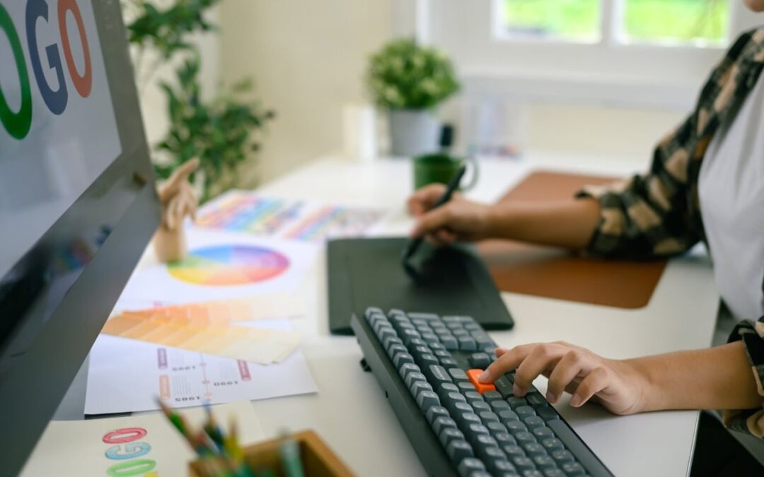
Walk past any food court and squint. What do you see? A wall of red, yellow, and orange. It’s not a coincidence, it’s not a trend, and it’s certainly not lazy design. It’s one of the most calculated applications of color psychology in fast food...
by Allison Franks | Jul 12, 2026 | Uncategorized
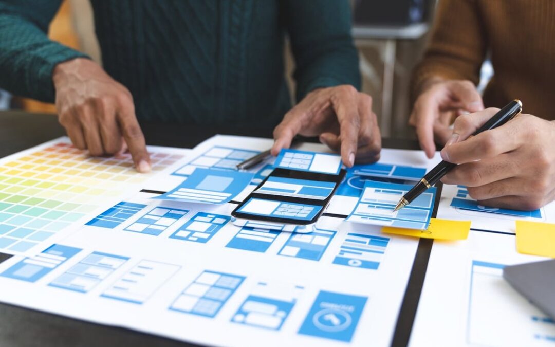
Every layout you admire, whether it’s a magazine spread, a startup landing page, or a Swiss-style poster, owes its clarity to one quiet hero: the grid. A grid system in graphic design is the invisible scaffolding that holds typography, images, and white space...

by Allison Franks | Jun 1, 2026 | Uncategorized
Mixing typefaces is one of those design skills that looks effortless when it works and painfully awkward when it doesn’t. The most reliable trick in the book? Pair a serif and a sans serif font. It’s a classic combo for a reason: the contrast is built in,...

by Allison Franks | May 8, 2026 | Uncategorized
What Is White Space in Graphic Design? White space, also called negative space, is the empty or unmarked area between and around design elements. It includes margins, gutters, padding, the space between lines of text, and any area free from images, text, or decorative...