

Typographic hierarchy is the system you use to rank text on a page so a reader knows, in under a second, what to look at first, second and third. It is built from four levers: size, weight, spacing and contrast. This guide defines each lever, then breaks down seven magazine and editorial layout examples line by line, with the specific point sizes, leading and weights that make each page readable at a glance.
Most articles on this topic stop at “make your headings bigger”. We are going further: every example below includes a real type scale table you can copy into your own layouts.
What is typographic hierarchy? (Short answer)
Typographic hierarchy is the deliberate arrangement of text using differences in size, weight, spacing, colour, case and style to signal relative importance. It turns a block of undifferentiated words into a map. Without it, every element shouts at the same volume and the reader has to do the sorting work themselves, which usually means they leave.
The minimum viable hierarchy has three levels:
- Primary: the headline or title. One per page. Largest, heaviest, most visually dominant.
- Secondary: subheadings, decks, section labels. Bridges the headline and the body.
- Tertiary: body copy, captions, credits, folios. Smallest, highest volume of text.
Editorial design normally extends that to six or seven levels, because a magazine spread carries kickers, bylines, pull quotes, sidebars and photo credits on the same page. That is exactly why magazine layouts are the best place to study hierarchy: they solve the hardest version of the problem.
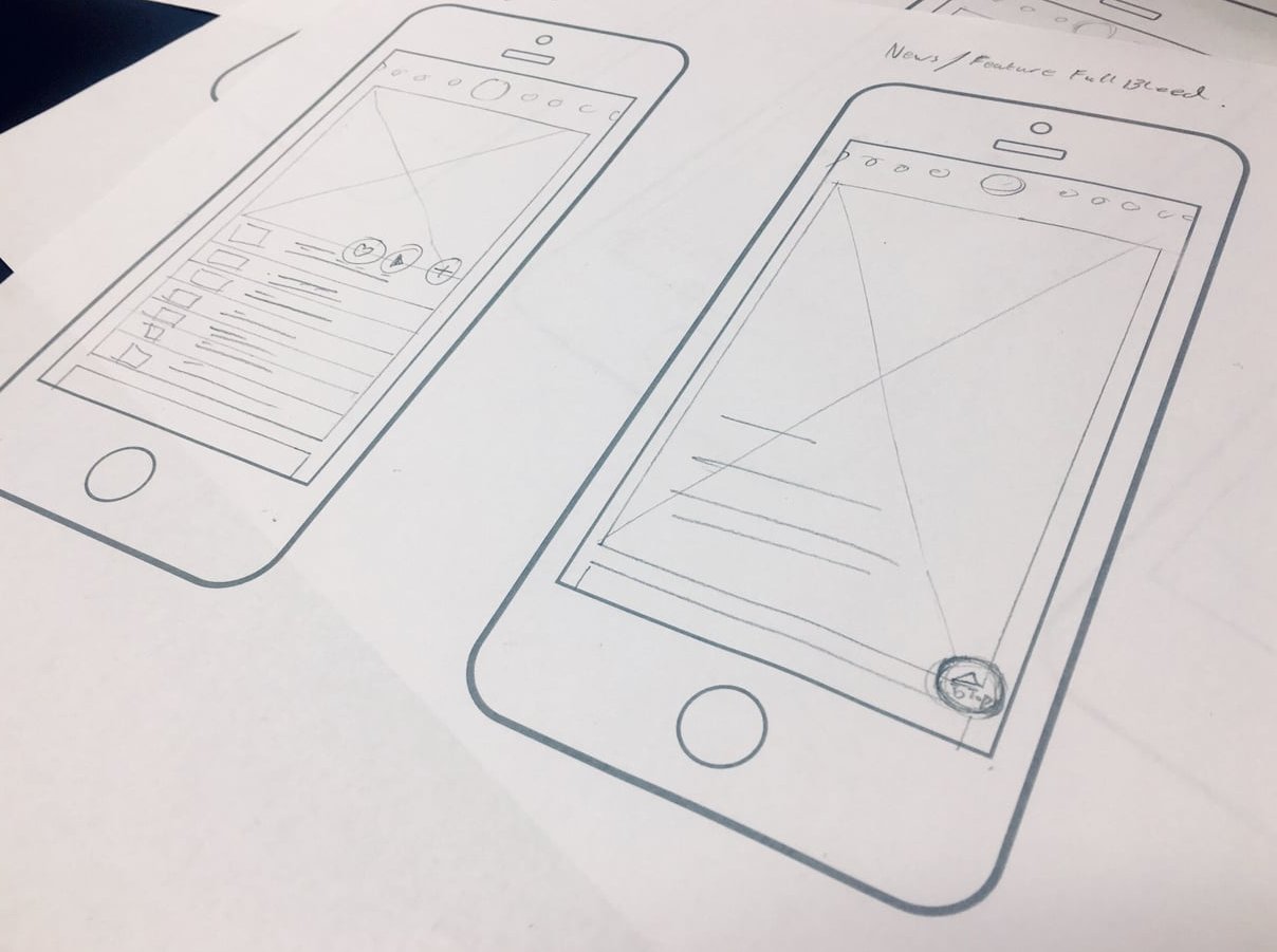
The four levers of typographic hierarchy
1. Size
The most literal signal. Bigger equals more important. The useful rule is not “make it big”, it is make the steps obvious. A 16px heading above 15px body text reads as a mistake, not a hierarchy. If two levels are within roughly 15% of each other in size, differentiate them another way instead.
Designers usually generate sizes from a modular scale, a base size multiplied repeatedly by a fixed ratio:
| Ratio | Name | Scale from 16px | Best for |
|---|---|---|---|
| 1.125 | Major second | 16, 18, 20, 23, 26 | Dense dashboards, data tables |
| 1.200 | Minor third | 16, 19, 23, 28, 33 | UI, documentation, long body text |
| 1.250 | Major third | 16, 20, 25, 31, 39 | Blogs, marketing pages (safe default) |
| 1.333 | Perfect fourth | 16, 21, 28, 38, 51 | Editorial pages, landing heroes |
| 1.500 | Perfect fifth | 16, 24, 36, 54, 81 | Posters, feature openers, covers |
2. Weight
Weight creates hierarchy without consuming space, which is why it carries so much load in magazines where column width is fixed. A 10pt bold lead-in and 10pt regular body occupy identical real estate but read as two different levels. Skip at least two weight steps between adjacent levels: Regular to Bold reads clearly, Regular to Medium often does not at small sizes.
3. Spacing
Space is the lever amateurs ignore and professionals obsess over. It works on four axes:
- Letter spacing (tracking): open tracking of 0.08em to 0.15em turns small uppercase text into a label. Negative tracking of -0.01em to -0.03em makes large display type feel set rather than typed.
- Line spacing (leading): body copy sits around 140% to 160% of its size. Display type drops to 90% to 110%, because big text needs less air between lines to stay cohesive.
- Space before and after: an element belongs to whatever it sits closest to. Always give a subheading more space above it than below it, so it attaches to the text it introduces.
- Margins and column gutters: the frame that makes everything inside it legible.
4. Contrast
Contrast is everything that is not size: colour, case, style (roman versus italic), typeface pairing, and background. A deck set in a light grey italic serif is instantly distinguishable from body copy set in a black roman sans, even at a similar size. Just keep an eye on legibility: body text should stay at a contrast ratio of at least 4.5:1 against its background, and large display type at 3:1. If you are picking editorial colour pairs, run them through a colour and contrast tool before you commit the layout.
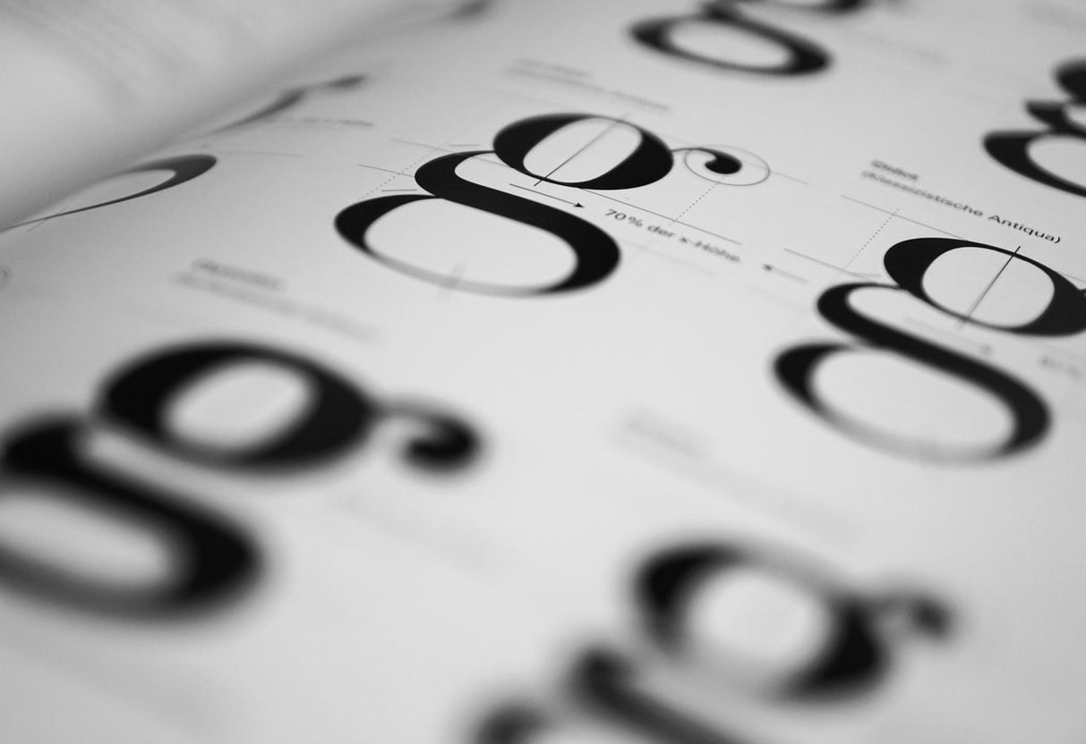
The seven levels found in editorial layouts
| Level | Element | Typical treatment |
|---|---|---|
| 1 | Headline | Display face, 48pt to 120pt, tight leading |
| 2 | Deck / standfirst | 16pt to 24pt, italic or light, generous leading |
| 3 | Pull quote | 24pt to 40pt, often a third typeface or accent colour |
| 4 | Kicker / section label | 8pt to 11pt uppercase, wide tracking, accent colour |
| 5 | Subheads / crossheads | 11pt to 14pt bold, space above |
| 6 | Body copy | 8.5pt to 10.5pt, 130% to 150% leading |
| 7 | Captions, credits, folios | 6.5pt to 8pt, often italic or a contrasting sans |
Note that level 4 is physically the smallest text on the page but functionally sits near the top. Hierarchy is about order of attention, not order of size. A tiny red uppercase kicker above a huge headline gets read first because contrast and position override scale.

7 typographic hierarchy examples from editorial layouts
Each of the following is a layout archetype you will recognise from print and digital magazines. For every one you get the structure, the type scale, and the single decision that makes it work. How to Structure an Effective Typographic Hierarchy is a useful companion to this.
Example 1: The full-bleed feature opener
What it looks like: A photograph covering the whole spread, with an enormous headline knocked out in white across the lower third, a short deck beneath it, and a photo credit rotated along the gutter.
| Element | Size / leading | Weight & style |
|---|---|---|
| Kicker | 9.5pt / 12pt, tracking 0.14em | Grotesk Medium, uppercase, accent colour |
| Headline | 96pt / 88pt, tracking -0.02em | Display serif Bold, white |
| Deck | 18pt / 26pt | Serif Regular Italic, 85% white |
| Byline | 8pt / 11pt, tracking 0.1em | Grotesk Bold, uppercase |
| Photo credit | 6pt / 7pt | Grotesk Regular, 60% white, rotated 90° |
Why it works: the headline-to-body ratio is roughly 10:1. That extreme jump means no one can mistake the entry point. The leading on the headline is tighter than its point size (88pt leading on 96pt type), which locks three lines into a single visual block instead of three floating sentences.
Steal this: when display type goes above 48pt, reduce leading to 90% to 95% and apply negative tracking. Defaults designed for 16pt text always look loose and amateurish when scaled up.
Example 2: The all-type opener (no image)
What it looks like: A Swiss-influenced spread with no photography at all. A hairline rule across the top, a section label at the left margin, a headline occupying the top half in a light weight, and body copy starting low on the page in three narrow columns.
| Element | Size / leading | Weight & style |
|---|---|---|
| Section label | 8pt / 10pt, tracking 0.2em | Neo-grotesk Regular, uppercase |
| Headline | 64pt / 62pt | Neo-grotesk Light, sentence case |
| Deck | 14pt / 20pt | Same family, Bold |
| Body (3 cols) | 9pt / 13.5pt | Same family, Regular |
| Folio | 7pt / 9pt | Regular, 50% black |
Why it works: one typeface, five levels, zero decoration. The hierarchy is carried almost entirely by size plus whitespace. Note the inversion: the headline is the lightest weight on the page while the deck is the heaviest. At 64pt, a Light weight still has far more visual mass than 14pt Bold, so the system holds.
Steal this: you do not need multiple typefaces. A single family with four or five weights can produce a complete hierarchy, and it will almost always look more disciplined.
Example 3: The Q&A interview spread
What it looks like: Portrait on the left page, interview text on the right. Questions set in bold, answers in regular, with speaker initials in an accent colour and a drop cap opening the first answer. This write-up is worth a look.
| Element | Size / leading | Weight & style |
|---|---|---|
| Headline | 42pt / 40pt | Serif Bold |
| Intro paragraph | 12pt / 17pt | Serif Italic |
| Drop cap | 3 lines deep (approx. 38pt) | Display serif, accent colour |
| Question | 10pt / 14pt | Sans Bold, 100% black |
| Answer | 10pt / 14pt | Serif Regular, 90% black |
| Speaker initials | 10pt, tracking 0.05em | Sans Bold, accent colour |
| Caption | 7.5pt / 10pt | Sans Regular, 65% black |
Why it works: questions and answers are the same size. The distinction comes purely from weight, typeface and colour. This is hierarchy at a single scale level, sometimes called lateral hierarchy: two elements of equal importance that still need to be told apart.
Steal this: when two elements alternate dozens of times, never separate them by size. Size differences compound into visual noise over a long page. Use weight or colour instead.
Example 4: The data explainer page
What it looks like: A single-page infographic. One enormous statistic anchors the top, supported by a chart, three annotation blocks and a source line at the bottom.
| Element | Size / leading | Weight & style |
|---|---|---|
| Hero figure | 120pt / 100pt, tabular figures | Grotesk Black |
| Figure label | 14pt / 18pt | Grotesk Medium |
| Chart axis labels | 7pt / 9pt | Grotesk Regular, 55% black |
| Annotation heads | 9.5pt / 12pt | Grotesk Bold |
| Annotation body | 8.5pt / 12pt | Grotesk Regular |
| Source line | 6.5pt / 8pt | Grotesk Regular Italic, 50% black |
Why it works: there is a deliberate dead zone between 14pt and 120pt. Nothing occupies the middle, so the eye lands on the number with zero competition, then drops straight to the detail layer. Axis labels are greyed to 55% so the chart shape, not its labelling, reads first.
Steal this: hierarchy is improved as much by removing middle levels as by adding big ones. If three elements are all semi-important, demote two.
Example 5: The product roundup grid
What it looks like: Twelve products across a spread, each with a number, an image, a name, a one-line description and a price. Highly repetitive, which makes it unforgiving.
| Element | Size / leading | Weight & style |
|---|---|---|
| Spread title | 36pt / 34pt | Condensed Bold, uppercase |
| Item number | 22pt / 22pt | Condensed Light, accent colour |
| Product name | 10pt / 12pt, tracking 0.04em | Sans Bold, uppercase |
| Description | 8pt / 11pt | Sans Regular |
| Price | 8pt / 11pt | Sans Bold, tabular figures |
Why it works: within each module there are only three levels, and they repeat identically twelve times. The reader learns the pattern once at module one and then scans the remaining eleven at speed. The item numbers, set large but light, function as navigation rather than content.
Steal this: in repeating modules, cap the hierarchy at three levels and keep vertical spacing between the levels identical in every card. Consistency is the hierarchy.
Example 6: The long-read with pull quotes and a sidebar
What it looks like: A continuation spread, four pages into a feature. Two text columns, a pull quote breaking across the middle, crossheads every 600 words, and a tinted sidebar box occupying one column of the right page.
| Element | Size / leading | Weight & style |
|---|---|---|
| Pull quote | 28pt / 30pt | Display serif Italic, accent colour |
| Quote attribution | 8pt / 10pt, tracking 0.12em | Sans Medium, uppercase, 60% black |
| Crosshead | 11pt / 13pt, 18pt space above, 6pt below | Sans Bold, uppercase |
| Body copy | 9.5pt / 13.5pt | Text serif Regular |
| Sidebar head | 13pt / 15pt | Sans Bold |
| Sidebar body | 8.5pt / 12pt | Sans Regular, on 8% tint |
| Running head | 7pt / 9pt | Sans Regular, 50% black |
Why it works: the sidebar switches from serif to sans, which signals “this is a parallel track, not the main argument”. The crosshead spacing is the quiet hero here: 18pt above versus 6pt below, a 3:1 ratio that visually glues each crosshead to the paragraph it introduces.
Steal this: the single most common hierarchy bug in web and print alike is equal space above and below a heading. It leaves the heading floating between two sections, and the reader has to guess which one it belongs to.
Example 7: The responsive digital feature
What it looks like: The web version of a magazine feature. One column, maximum 68 characters per line, fluid type that scales between mobile and desktop.
| Element | Mobile (375px) | Desktop (1440px) | Line height |
|---|---|---|---|
| Kicker | 12px | 13px | 1.2 |
| H1 | 34px | 64px | 1.05 |
| Deck | 18px | 22px | 1.45 |
| H2 | 24px | 32px | 1.2 |
| H3 | 19px | 24px | 1.3 |
| Body | 17px | 19px | 1.6 |
| Pull quote | 22px | 34px | 1.3 |
| Caption | 14px | 15px | 1.4 |
Why it works: the hierarchy compresses on small screens rather than scaling proportionally. The H1 shrinks by 47% from desktop to mobile, but the body text shrinks by only 11%. Captions barely move at all. If you scaled everything by the same factor, mobile body copy would become unreadable at 10px. The piece Ultimate Guide to Typography in Design makes a good next read.
Steal this CSS pattern:
:root {
  --step-0: clamp(1.0625rem, 1rem + 0.25vw, 1.1875rem);  /* body */
  --step-1: clamp(1.1875rem, 1.1rem + 0.4vw, 1.5rem);     /* h3 */
  --step-2: clamp(1.5rem, 1.3rem + 0.9vw, 2rem);          /* h2 */
  --step-4: clamp(2.125rem, 1.4rem + 3.2vw, 4rem);        /* h1 */
}
Side by side: what each example teaches
| # | Layout | Dominant lever | Key ratio | Lesson |
|---|---|---|---|---|
| 1 | Full-bleed opener | Size | 10:1 headline to body | Tighten leading as type grows |
| 2 | All-type opener | Space | 7:1 headline to body | One family can carry five levels |
| 3 | Q&A spread | Weight | 1:1 question to answer | Equal size, different weight |
| 4 | Data explainer | Contrast | 14:1 figure to body | Delete the middle level |
| 5 | Product grid | Repetition | 1.25:1 name to description | Three levels max per module |
| 6 | Long read | Spacing | 3:1 space above vs below heads | Proximity assigns ownership |
| 7 | Responsive feature | Fluid size | 3.4:1 H1 to body (desktop) | Compress, do not scale uniformly |
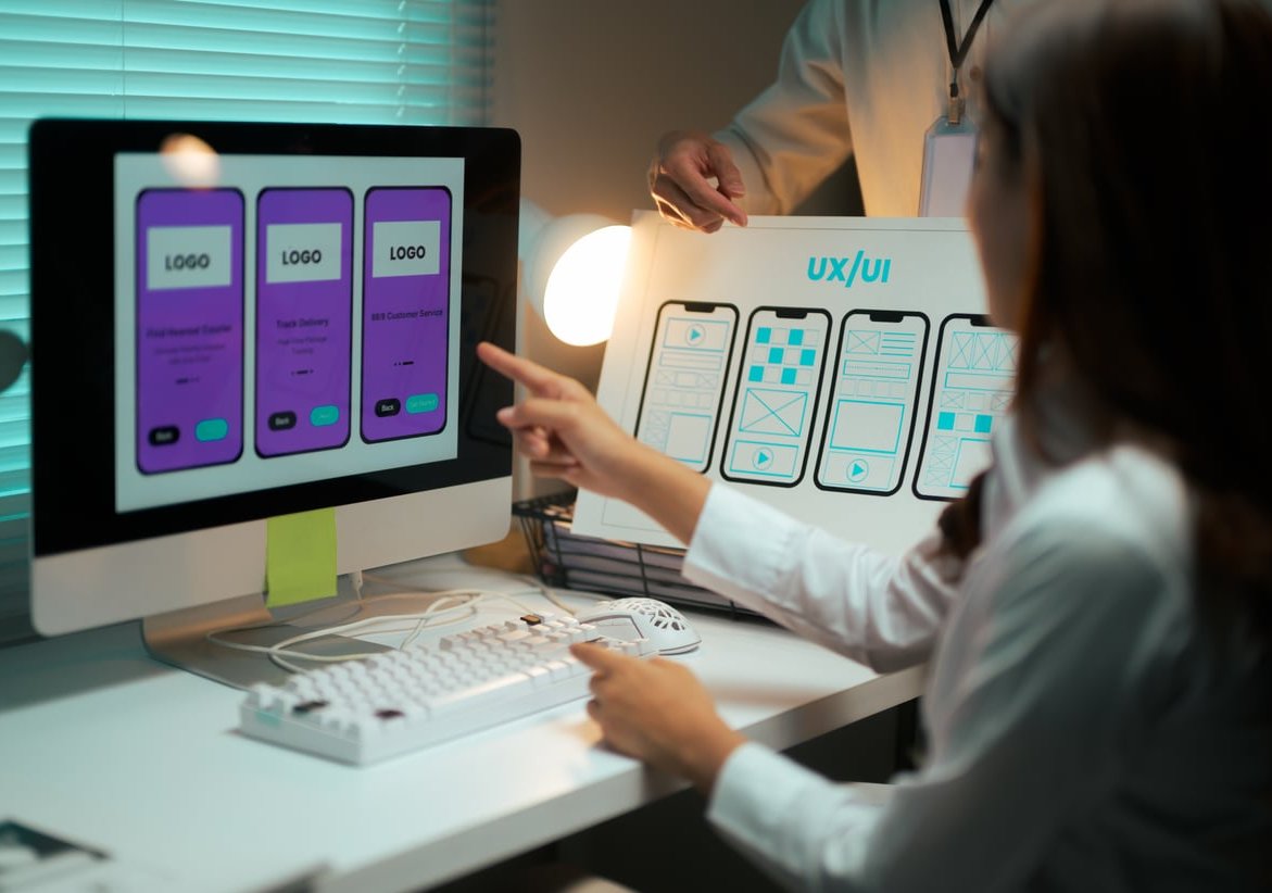
How to build your own typographic hierarchy in 6 steps
- List every text element the page will ever need, including the boring ones: timestamps, credits, legal lines, labels.
- Rank them by reading order, not by size. Ask what you want read first, second, third if the reader gives you three seconds.
- Collapse the list into a maximum of five or six levels. Anything you cannot clearly distinguish should be merged.
- Pick a base size and a ratio. 16px to 19px base for screen, 9pt to 10pt for print. Use 1.25 for interfaces, 1.333 or 1.5 for editorial.
- Assign weight, case and colour to each level, making sure no two adjacent levels share all three attributes.
- Squint test it. Blur the page until words become grey shapes. If the shapes do not form an obvious 1, 2, 3 path, the hierarchy fails regardless of how nice the fonts are.
Seven mistakes that flatten your hierarchy
- Steps that are too small. 18px H3 above 16px body does nothing. Jump at least 20%, or change weight as well.
- Too many levels. Eight distinct text styles means none of them is distinct.
- Equal space above and below headings. Covered above, and still the most frequent error.
- Default leading on display type. Huge text with 1.5 line height falls apart into loose stripes.
- Bold everything. If four levels are bold, bold no longer means anything.
- Light grey body text. Demoting body copy below 4.5:1 contrast makes it decorative rather than readable.
- Line lengths over 90 characters. Hierarchy cannot rescue a paragraph the eye cannot track back across. Aim for 45 to 75 characters.
A quick hierarchy audit checklist
- Can you identify the single most important element in under one second?
- Are there exactly three to six text styles, not twelve?
- Does every heading sit closer to the content below it than above it?
- Does display type use tighter leading and tighter tracking than body type?
- Is body copy at least 4.5:1 contrast and between 45 and 75 characters per line?
- Does the hierarchy survive the squint test and the greyscale test?
- On mobile, do the headline and body still read as separate levels?
FAQ
What are the 12 visual hierarchy principles?
The commonly cited list covers: size, scale, colour, contrast, alignment, repetition, proximity, whitespace, texture, style, typographic hierarchy and perspective or depth. Typographic hierarchy is one principle inside that larger set, but in text-heavy layouts it is the one doing most of the work.
What are some examples of hierarchies in design?
A newspaper front page, a restaurant menu, an invoice, a website navigation bar, a book chapter opener, an event poster and a mobile app settings screen all use hierarchy. Each ranks information so a reader can skip to the part they need: the headline, the dish name, the total owed, the section they want.
Which typographic example applies hierarchy principles best?
Any layout where you can name the reading order without reading the words. The full-bleed feature opener in Example 1 is the clearest demonstration because its headline-to-body ratio is roughly 10:1, but Example 3 is arguably more instructive: it proves hierarchy can exist between two elements of identical size, using weight and colour alone.
What are the 7 key elements of typography?
Typeface, font weight and style, point size, leading (line spacing), tracking and kerning (letter spacing), measure (line length), and alignment. Hierarchy is the result of combining these elements across multiple levels of text rather than an eighth element on its own.
How many levels of typographic hierarchy should a page have?
Three is the minimum (heading, subheading, body). Five or six is normal for editorial and marketing pages. Beyond seven, readers stop perceiving the distinctions and the system reads as inconsistency.
What is a good headline to body text ratio?
For web pages, 2.5:1 to 4:1 works well. For print feature openers and posters, ratios of 6:1 to 12:1 are standard because the page is viewed at a greater distance and needs a stronger entry point.
Can you create hierarchy with only one typeface?
Yes, and it often looks better. A family with four to six weights plus italics gives you more than enough range. Example 2 above builds five levels from a single neo-grotesk family using nothing but size, weight and space.
Final thought
Every one of these typographic hierarchy examples comes down to the same discipline: decide the reading order first, then make the type reflect that decision with gaps big enough to be unmistakable. Size gets you the first level. Weight, spacing and contrast get you the other five. Build the scale once, apply it ruthlessly, and your pages will read at a glance instead of being deciphered.